Latest HMRC Tax Webinars
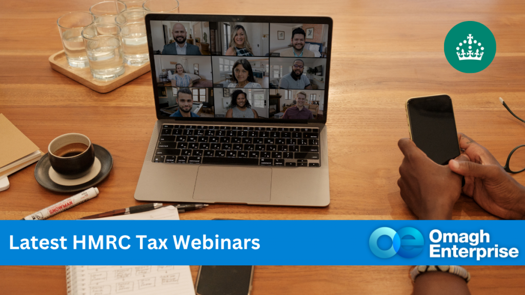
Upcoming webinars from HM Revenue & Customs (HMRC) to help employers, businesses and the self-employed understand tax issues that affect them. Listed below are a
Upcoming webinars from HM Revenue & Customs (HMRC) to help employers, businesses and the self-employed understand tax issues that affect them. Listed below are a

Growing a business isn’t just about working harder – it’s about having the right business mentoring support to work smarter. The right guidance at the
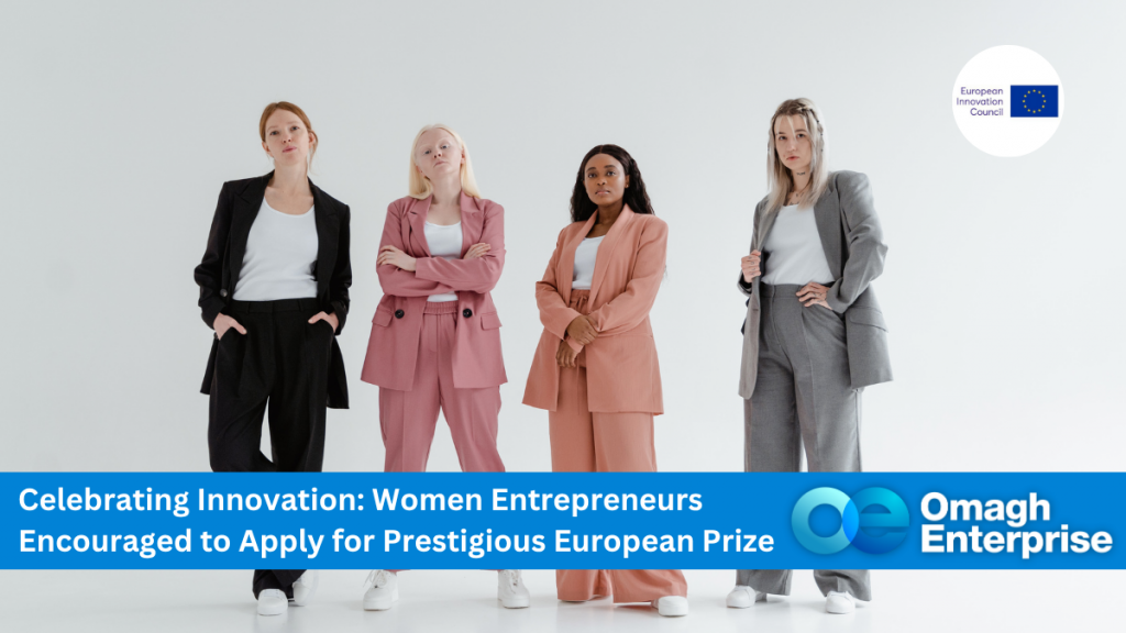
Are you a woman in business with an innovative idea that’s making a difference? Based in the Omagh area and driving change through your enterprise?
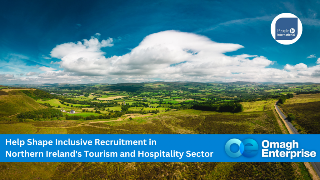
Tourism and hospitality businesses across Northern Ireland are being invited to take part in an important research project exploring how the sector can improve inclusive
Northern Ireland is fast becoming a launchpad for ambitious entrepreneurs. With strong support networks and growing access to infrastructure, the region offers excellent opportunities for
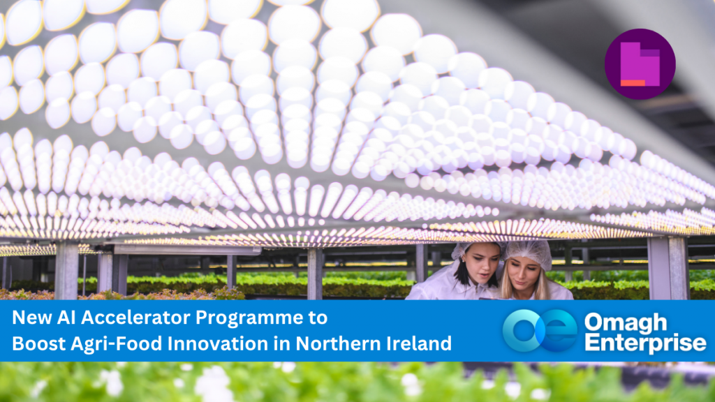
Businesses in the agri-food sector across Northern Ireland – including here in Omagh – now have an exciting opportunity to harness the power of artificial
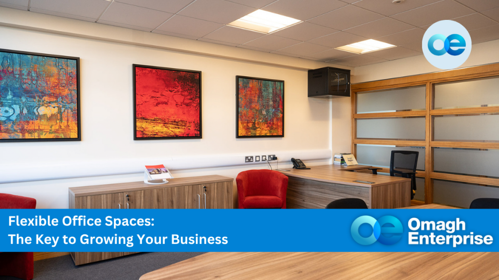
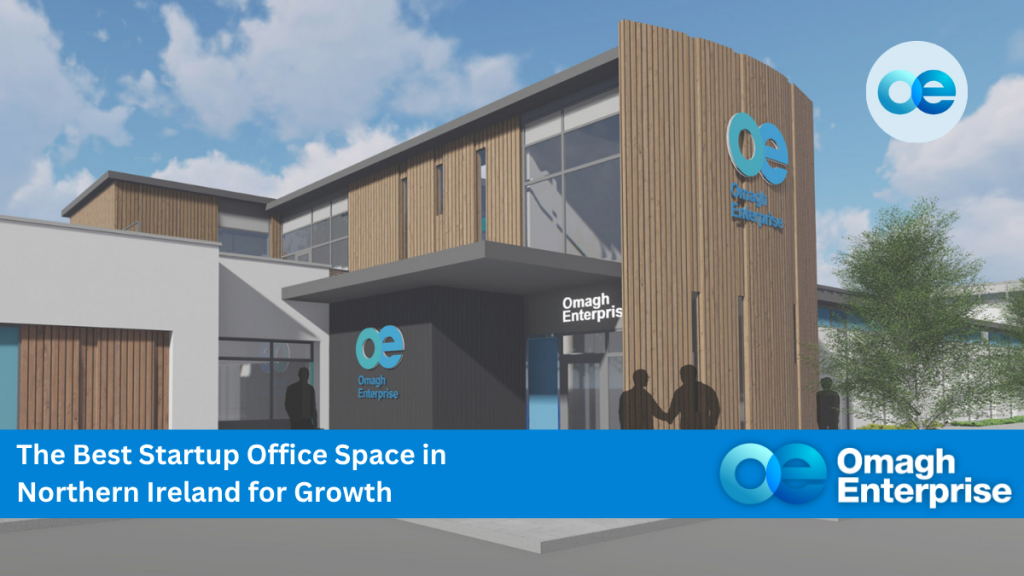
In today’s ever-changing business environment, startups and SMEs benefit hugely from flexible office space – it’s more than a convenience; it’s a strategic advantage. Whether
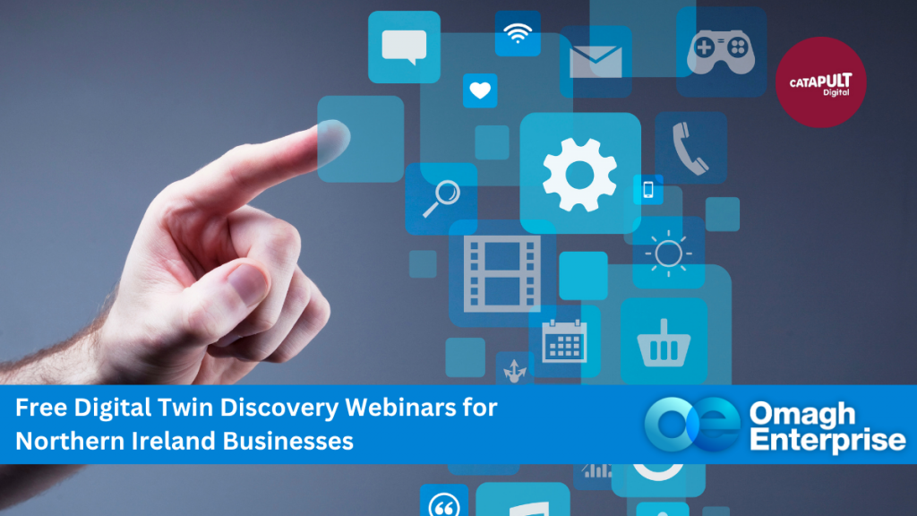
Businesses in Omagh and across Northern Ireland are invited to join a new Digital Twin Discovery Webinar, designed to help organisations understand how this cutting-edge
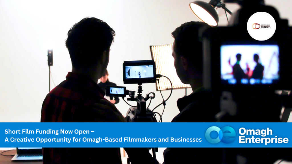
Northern Ireland Screen has officially launched its Short Film Call 2025, offering a valuable opportunity for filmmakers, creatives, and production companies in the Omagh area
Upcoming webinars from HM Revenue & Customs (HMRC) to help employers, businesses and the self-employed understand tax issues that affect them. Listed below are a
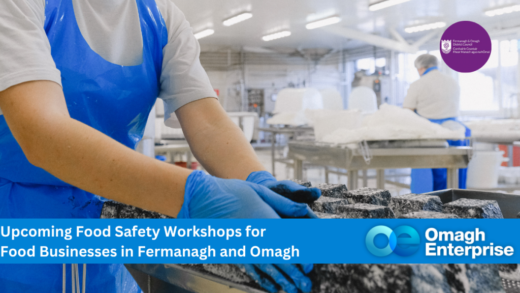
If you run or are planning to start a food business in the Fermanagh and Omagh area, don’t miss out on a series of free
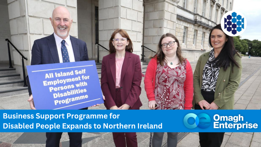
A new 12-week Self-Employment for Disabled People Programme—delivered by TU Dublin in partnership with the Department for the Economy, Leonard Cheshire, Go Succeed NI and